
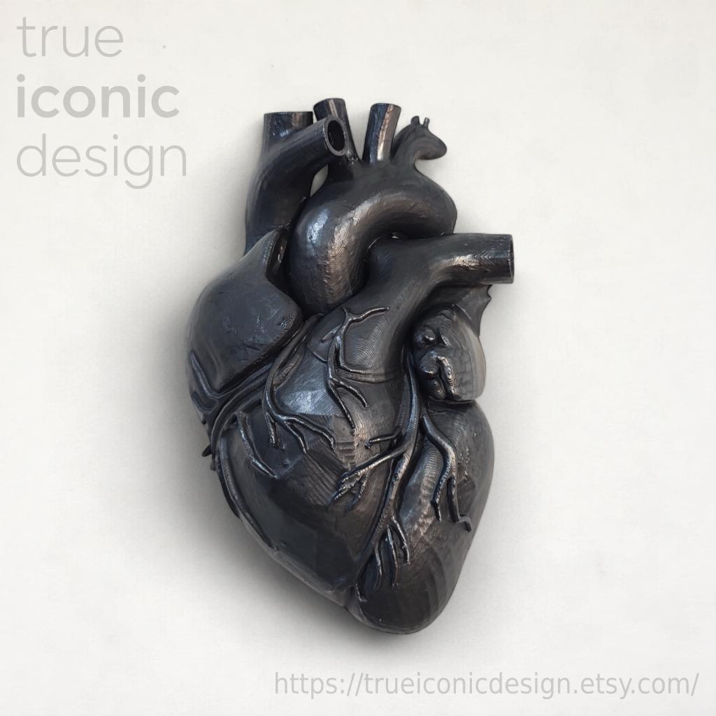
Dark Graphite: The Chromatic Grammar of Domestic Intimacy
Dark graphite is not the absence of color. It is a full, dense color that occupies space with the same force as a red or a cobalt blue. The difference lies in the way it acts: it does not shout, it does not impose itself. It absorbs light, holds it, and returns it in metallic flashes when the angle changes.
In domestic spaces, graphite builds a visual vocabulary made of depth and contemplation. It is the color that allows other colors to exist with greater intensity, but it is also the one that, on its own, transforms a wall into a visual refuge.
When Graphite Meets Other Colors
Dark graphite works as a chromatic amplifier: next to it, every shade reveals unexpected nuances and gains emotional weight.
Off-white and cream, placed next to graphite, lose their aseptic neutrality. They become warm, almost carnal. The contrast is not sharp as with pure white: it is soft, it breathes. A graphite wall with cream-colored shelves creates a tactile dialogue even before a visual one.
Burgundy red and plum, on the other hand, evoke the sanguine universe without falling into decorativeness. Graphite anchors them, holds them back. A burgundy cushion on an anthracite gray sofa is not an accent: it is a controlled wound, a visible heartbeat.
| Pairing | Perceived effect | Emotional temperature |
|---|---|---|
| Graphite + off-white | Tactile softness | Warm, welcoming |
| Graphite + burgundy | Controlled tension | Passionate, restrained |
| Graphite + antique gold | Discreet preciousness | Warm, sophisticated |
| Graphite + petrol green | Mysterious depth | Cold, introspective |
Antique gold and copper bring warmth without cheerfulness. They are metals that have lived, bearing traces of oxidation. Next to graphite, they illuminate without piercing the mystery. A burnished brass lamp on a graphite console creates a point of light that does not disturb the room's chromatic silence.
Forest green or petrol green introduces a cool note, almost underwater. It is a contrast in temperature, not saturation. Both colors share the same density, the same ability to absorb the gaze. They work well in rooms where concentration is sought: studies, libraries, bedrooms designed for deep rest.
The Light That Changes Graphite
The perception of dark graphite depends more on the quality of light than on the quantity: grazing light enhances its metallic reflections, while diffused light makes it matte and textural.
Morning natural light, oblique and cool, brings out the blue components of graphite. The same surface, under a warm incandescent lamp, shifts toward dark brown. It is not a flaw: it is a richness. Graphite is a color that moves over time, that accompanies the hours of the day.
Grazing light, the kind that skims surfaces almost parallel to them, is the most effective for three-dimensional graphite objects. It brings out textures, striations, volumes. An anatomical wall sculpture in dark graphite becomes a landscape of shadows and reflections when illuminated by an adjustable spotlight positioned to the side.
How to Light a Graphite Object
- Positioning of the light source: Side, never front. The light must graze, not hit.
- Color temperature: 2700-3000K to enhance warm undertones, 4000K to maintain metallic coolness.
- Intensity: Medium-low. Graphite does not need to be “illuminated”, but “grazed” by light.
Diffused light, on the other hand, evens out. It cancels reflections, makes the surface matte and compact. It is useful when you want graphite to function as a background, as a theatrical backdrop for other elements. A graphite wall lit by diffused light becomes a neutral backdrop, but never as cold as white.
Graphite as an Anchor Color and a Refuge Color
In rooms that are too bright, graphite anchors the gaze and prevents visual dispersion. In already dark rooms, it creates a refuge that does not oppress.
In an environment dominated by whites, light grays, and natural woods, a dark graphite element acts as a point of gravity. The gaze returns to it, rests on it. It doesn't need to be large: it just needs to be dense. An object measuring 15×22 cm, with a depth of 6 cm, can be enough if positioned at eye level, at a natural visual passage point.
- In minimalist bedrooms, as a guardian of sleep
- In studies and home offices, to foster concentration
- In entryways, as the first element of contrast to outdoor light
- In contemporary living rooms, above linear cream or light gray sofas
In already dark rooms, graphite does not weigh things down if accompanied by materials that break up its compactness. Velvet, for example, introduces tactile softness. Charred or wengé wood creates a material dialogue. Smoked glass or dark mirrors amplify depth without introducing light.
Graphite also works in unexpected environments. In the kitchen, paired with brushed steel and veined white marble, it introduces an element of contrast that prevents the space from slipping into the aseptic. In the bathroom, combined with mirrors with black metal frames, it evokes the aesthetic of Victorian medical cabinets without falling into pastiche.
Anatomy of a Graphite Object
An anatomical heart made of 3D-printed plastic, painted in dark graphite with metallic reflections, measures 22 cm in height, 15 cm in width, and 6 cm in depth: it is a concrete example of how color transforms the perception of an object.
La forma anatomica, fedele alla morfologia del cuore umano, porta con sé un carico simbolico immediato. Ma è il colore a decidere come quel simbolo viene letto. In rosso, sarebbe passione esplicita. In bianco, purezza o clinica. In grafite scuro con finitura semi-lucida, diventa mistero, potenza trattenuta, intimità protetta dall’ombra.
I riflessi metallici sulla superficie non sono decorativi: sono funzionali alla lettura del volume. Cambiano con l’angolazione, rivelano la complessità della rete vascolare in rilievo. La micro-texture striata, eredità del processo di stampa 3D, aggiunge una dimensione tattile percepibile anche a distanza.
Posizionato al centro di una parete color panna, tra cornici vuote o stampe in bianco e nero, diventa il fulcro visivo. Non serve altro. Il grafite concentra l’attenzione, impedisce la dispersione. Sopra un camino spento o una consolle stretta, illuminato da una lampada laterale, proietta ombre proprie che amplificano la sua presenza fisica.
Esporre oggetti grafite in ambienti saturi di colori pastello o eccessivamente luminosi ne annulla il mistero. Il grafite ha bisogno di contrasti netti o di compagni cromatici altrettanto densi.
Costruire una Palette Intorno al Grafite
Il grafite scuro non è un colore di passaggio: è un colore di destinazione. Attorno a lui si costruisce una palette, non il contrario.
La palette monocromatica, tutta giocata su grigi e neri, è la più radicale. Funziona in spazi dove si cerca un effetto total look drammatico. Ma richiede attenzione alle texture: senza variazioni materiche, rischia di appiattirsi. Velluto, metallo spazzolato, legno scuro, pietra: ogni materiale introduce una sfumatura diversa di grigio.
La palette calda, con oro antico, rame e borgogna, è più accogliente. Il grafite diventa lo sfondo su cui questi colori brillano senza urlare. È una scelta adatta a camere da letto, salotti, studi dove si cerca concentrazione ma non freddezza.
La palette fredda, con verde petrolio, blu notte e acciaio, è introspettiva. Funziona in spazi creativi, biblioteche, home office. Il grafite qui non è il colore più scuro: condivide la profondità con gli altri, creando un ambiente avvolgente ma non oppressivo.
In ogni caso, un elemento scultoreo in grafite scuro non va mai affollato. Ha bisogno di respiro visivo, di spazio vuoto intorno. Non è un oggetto da collezione da accostare ad altri: è un protagonista solitario.
—
Il grafite scuro non chiede di essere capito subito. Si rivela nel tempo, cambia con la luce, dialoga con i materiali vicini. È il colore di chi non teme il silenzio visivo, di chi cerca profondità negli spazi domestici. Non è per tutti. Ed è proprio questo il suo valore.
Q&A
Why is dark graphite considered a chromatic amplifier?
Graphite absorbs light and returns it in metallic flashes, bringing out unexpected nuances in the colors next to it. Off-white becomes warm and carnal, burgundy gains controlled tension. Every shade reveals greater emotional weight compared to light neutral surfaces.
Which warm colors pair best with dark graphite?
Off-white and cream create a soft and tactile dialogue, while burgundy and plum bring restrained passion. Antique gold and copper add discreet preciousness without breaking the mystery. All these combinations maintain a warm and sophisticated emotional temperature.
How does dark graphite change depending on the light?
The oblique natural morning light brings out the blue components of graphite, while a warm incandescent lamp shifts it toward brown. Raking light enhances the metallic reflections, diffused light makes it matte and textural. The quality of light matters more than the quantity.
In which environments does the pairing of graphite and petrol green work best?
Forest green or petrol next to graphite creates a contrast of temperature, not saturation, ideal for rooms dedicated to concentration. It works well in studies, libraries, and bedrooms designed for deep rest. Both colors share density and the ability to absorb the gaze.
Is dark graphite really a neutral color?
No, dark graphite is not the absence of color but a full and dense color, with the same strength as a red or a cobalt blue. Unlike bright tones, it does not shout and does not impose itself: it absorbs light and holds it. This is why it transforms a wall into a visual refuge.